The Indispensable Blueprint at the Heart of Your Communications

By Mitchell Jordan

I challenge you to think of a complex project that doesn’t start with a blueprint. An interior designer would never furnish a house without first consulting the master floorplan, and a novelist can’t delve into character development without at least mapping out a rough table of contents. The same logic applies when designing brand communications: no business leader should consider launching a television spot—or even uploading a new social media avatar—before establishing formal brand guidelines.

What exactly are brand guidelines, anyways?

Brand guidelines summarize the most important aspects of a brand and explain how (and how not) to communicate a brand’s essence. Not to be confused with simplified style guidelines, brand guidelines simultaneously govern visual elements (from logos and fonts to color palettes and photography) and lay out rules for structuring communications according to a brand’s philosophy, tone, and voice. When working with a remote team or collaborating with external partners, a set of clear, comprehensive brand guidelines anchors the creative process and helps forge a readily recognizable brand identity across multiple channels and different campaigns.

Prioritizing brand guidelines may seem like a no-brainer, but brands often bypass this step and jump right into creative executions. In the case of busy startups, a backlog of time-sensitive projects and a scrappy approach to budgeting can take precedence over the nebulous task of hammering out brand guidelines. In other instances, asset creation may fall to a single individual who already knows the brand inside and out and doesn’t see the need to formulate official guidelines.

While extensive brand guidelines may seem excessive or redundant for small, emerging brands, it’s important to keep your long-term growth plans in mind. As the scope of your communications broadens and the size of your team expands, brand guidelines save time and money by streamlining the creative process. Even more importantly, they ensure thematic harmony across all of your assets. Without any formal guidelines in place at the outset, the creative process can spiral into an organizational headache and a financial drain, and you risk producing disjointed creative that dilutes the power of your brand messages. Clarity and consistency are key when it comes to being taken seriously by clients and consumers, so adhering to brand guidelines is vital for establishing integrity in the long run.

Best practices for brand guidelines

There’s no universal template for crafting brand guidelines—they’re highly variable depending on a brand’s specific needs and the scope of its communications. But there are a few key considerations that every brand should focus on when developing its guidelines to ensure the final product is on-strategy, effective in the long-term, and simple to work with.

Start with strategy

As we say again and again at Dotted Line, always start with strategy. Since every brand approaches strategy from a slightly different angle, your brand guidelines may look totally different from examples you’ve seen before. For instance, incorporating highly technical photography standards into brand guidelines makes perfect sense for an interior design firm, but would feel out of place for a small IT startup. Furthermore, a brand’s strategy evolves over time as new opportunities emerge, so brand guidelines should be crafted with scalability in mind, ready to extend to a new application should the need arise. Whether pivoting from image-based social content to video or extending your new-age brand voice in traditional markets, accounting for upcoming strategic shifts ensures that brand guidelines bend—rather than break—as your business changes.

Play the long game

When committing to a set of standards that will steer your future creative projects, it’s natural to wonder how often you should refresh your guidelines and tempting to leave ample room to accommodate tweaks over time. But while brand guidelines need to be scalable, they should generally maintain a degree of rigidity and stability. After all, the whole point of a brand is to offer its consumers a sense of consistency and security over time. Exercising patience and continuously reinforcing foundational brand elements are key to achieving widespread and long-lasting awareness among consumers. When it comes to modifying your brand guidelines, augment them sparingly and thoughtfully as your brand grows, and resist the urge to make hasty changes every time a trendy new color palette or writing style crops up.

Focus on your team’s different needs

Even the most stunning, thorough brand guidelines can be rendered pointless if your team lacks the know-how or motivation to leverage them effectively. As a creative, I love it when clients hand over a hefty volume of brand guidelines for me to sink my teeth into, but most brands don’t have the need—or budget—for such expansive guidelines. And while your marketing department and creative partners require a certain degree of specificity, be realistic—your colleagues in IT don’t need ten pages of brand voice exploration to update the company-wide email signature. Consider developing smaller appendices to your brand guidelines tailored to different departments’ usages. Ease of use should be a primary consideration when rolling out your brand guidelines, so be sure to present assets to your team with accessibility in mind.

It’s short-sighted to think of brand guidelines as a tool that only large, unwieldy brands working with an array of partners need—they’re a must-have for any growing brand, regardless of size or industry. And while implementing any brand guidelines is a step in the right direction, the more comprehensive they are, the better. Between strategic alignment, long-term planning, and team-specific considerations, it’s no surprise that developing brand guidelines can be a daunting undertaking, and the process can often require in-depth theoretical knowledge or technical expertise depending on your brand’s needs. We’re here to ask the probing questions and formulate the best approach to create brand guidelines that work for your brand. Click here to reach out.

Why No Two Website Strategies Should Look the Same

By: Jason Anderson

If there was ever a time to dive headfirst into a website design project, 2021 is that time. As stay-at-home guidelines push businesses further into the virtual realm, compelling online touchpoints have never been more critical. Plus, with so many big projects on hold, this unexpected downtime presents a great opportunity to undertake a website launch or refresh.

It’s tempting to seek out shortcuts to fast-track the website design process, especially with COVID fueling a particularly scrappy approach to business decisions. Perhaps you’ve considered repurposing one of your other brands’ site layouts or replicating features from a competitor’s website. But while those are great places to look to for inspiration, they shouldn’t be the primary drivers of your design process. Every company possesses a unique business approach and a distinct set of short- and long-term objectives, meaning that a one-size-fits-all, cookie-cutter approach simply won’t cut it when it comes to website design.

So where exactly should you start your website design process?

Start with strategy

At Dotted Line, we find ourselves constantly reciting the mantra “everything starts with strategy.” Strategy highlights which challenges a new website should address, and it serves as a gut check underscoring every phase of the creative process. When in doubt, asking “Is this on strategy?” can differentiate between which site features are truly essential and which are just flashy bells and whistles.

Sometimes a strategy-first approach requires hard cuts. When a client struggles to explain how a site component fits into their strategic roadmap, that’s a clear indication that a better solution exists, just waiting to be tapped. Business leaders must remind themselves that “all of our competitors are doing it” or “a customer suggested it” isn’t enough justification on its own. Committing to staying on-strategy pushes a company to think critically about the role its website plays in the customer journey and lays the foundation for the most relevant and effective brand storytelling touchpoints.

Flying Phase’s website is a great example of the branded through-line resulting from a strategy-first approach. While the world of financial consulting is often marked by rigidity, Flying Phase is anything but. From its cutting-edge name—derived from a pioneering America’s Cup design that literally lifts elite racing vessels out of the water—to their forward-thinking “business beyond the horizon” positioning, Flying Phase stands out from stiffer, more traditional competition. This differentiation strategy is impossible to overlook in their website design: marked by a stunning hero video and a vibrant color palette, Flying Phase’s sleek site goes hand-in-hand with their innovative approach to consulting. In this case, Flying Phase’s strong strategic backbone proved key to setting their site firmly apart from other industry players.

Take it in phases

We think of website design as a dynamic, phased process. A static site that only addresses a client’s immediate needs isn’t practical in the long-term—the most effective websites grow alongside a company as its business evolves and its brand story deepens.

A phased approach is especially crucial when we work with trailblazing startups launching a website for the first time. While established companies often initiate design projects armed with an arsenal of multimedia assets and branded copy, burgeoning startups enter into the design process virtually from square one. These websites need to be flexible enough to tell an abbreviated brand story in the short-term and accommodate new brand assets, features, and copy as they arise three, six, and twelve months down the line.

EDai’s new site accomplishes exactly that. After months of fine-tuning a tech-based approach to economic development, EDai celebrated its official public launch in early 2021, and is still in the throes of establishing its brand story. In the meantime, they needed a clean-cut, polished website to promote their proprietary LocatED tool and consulting services, while leaving room to expand their online storytelling in the future. The resulting design ticks both boxes, nimbly telling the story of EDai’s consulting firepower and laying the foundation for adding thought leadership content as the business and team grow. The clean, straightforward design mirrors the ease of use of their tool and the direct professionalism at the heart of their company ethos, all while remaining adaptable as EDai’s online content evolves.

A path to the most effective website design

Since no two companies approach their strategy or scaling plans in exactly the same way, it follows that no two website designs should look exactly the same. But developing a website from scratch that’s laser-focused on your business needs is no small task. Synthesizing strategy and anticipating future developments (while maintaining focus and staying in-scope!) almost always requires expert guidance, which is where we can help. We’re no strangers to website design, and we pride ourselves on meeting clients where they are, regardless of business stage, project timeline, or design complexity. Plus, we work to cultivate a diverse extended team with wide-ranging capabilities. Whether your focus is content strategy, user experience design, or anything in between, we tap the right experts to get the job done. At the end of the day, what matters most to us—and you!—is crafting the most effective website to support your specific business needs.

Have questions for us about how to kick off your website design project? We’re ready to help. Click here to reach out.

Facilitating Effective Marketing Workshops

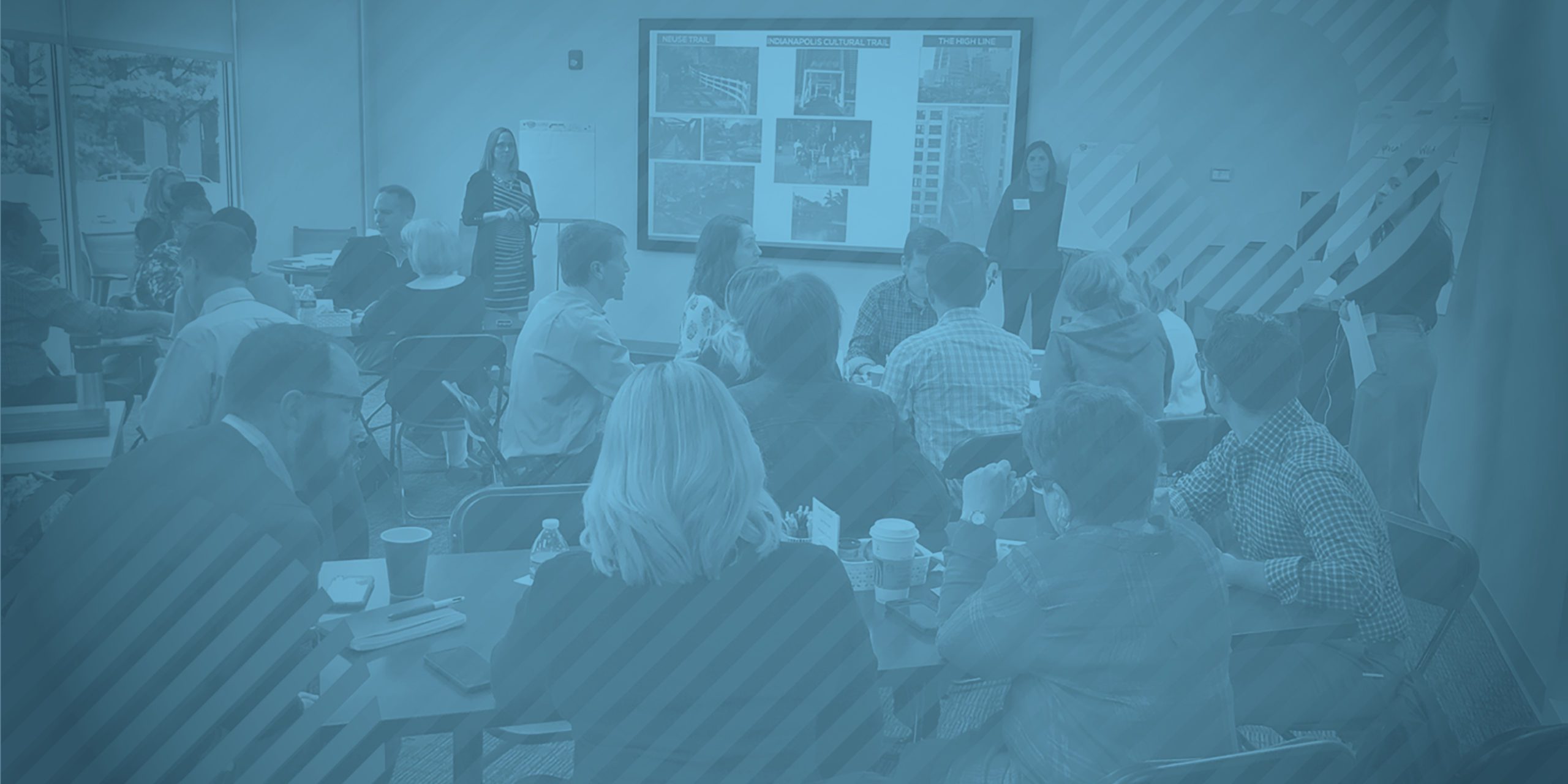
In February of this year, we had the opportunity to partner with PlanRVA and Sports Backers to lead a project that would result in the naming of a new trail extending from Ashland to Petersburg, Virginia. In our onboarding process, we learned that the trail would pass through seven jurisdictions within Central Virginia, reinforcing the importance of collaboration among localities.

As we took some time to plan for how we would lead our clients and the community through the process, we landed on the idea of inviting representatives from each group to a brainstorming workshop to learn about their visions for the trail firsthand. That way, their ideas, creativity, and potential concerns could be shared collectively, with guidance and structure from our team. A successful result required thoughtful planning for  how to structure the workshop. How would we make sure 20 people with different approaches could be heard – while promoting an environment of respect and learning from one another – and come away with a name everyone could be proud of?

With our goals clearly set, our team spent the weeks leading up to the event planning for a successful morning. We tested activities and brainstormed potential outcomes. We considered the time needed for the various exercises and thought through how to keep our community players engaged. Without careful planning, leading a team through such an exercise is like showing up to a big game without practice. In our “big game,” we needed to accomplish three things:

  1. Brainstorm and concept potential names
  2. Maintain a collective sense of community throughout the process
  3. Encourage participation from everyone in attendance

While we were incredibly passionate about the project, pulling the session together was no small task. Only by placing an emphasis on intentionality in our approach and execution were we able to set the stage for a successful outcome.

Whether you’re leading a session to inform a naming process, generate content ideas or facilitate communication between disconnected groups, the five key elements listed below can provide critical structure for driving productive dialogue among stakeholders with disparate goals. The elements work in conjunction with each other and act as a roadmap for encouraging discourse, helping groups reach their goals, and creating long-lasting relationships and impact.

  1. Know what you want to achieve. It sounds simple, but start with the end in mind. When all parties involved know what they’re working toward, it provides content, focus and clarity for individual contributors. It’s best to start your session by clarifying the ultimate goal and reinforcing that key objective as the day goes on. Tip: Have materials on the groups’ tables that reinforce the goal – and consider bringing a visual that supports the goal into the space to keep it front and center.
  2. Understand your audience. Who are you collaborating with, and what is/are their background(s)? It’s important to understand what your attendees’ day-to-day roles are and how you can engage with them. You may want to start by asking them to work in teams, which can help draw out those who are more reserved and get them involved in the conversation. Leaning into team work first, before sharing with the larger group, also allows for collaboration and trust-building to get the creative juices flowing. Tip: Choose groups that are diverse in both background and personality. This will hopefully lead to creative thinking and a mix of viewpoints
  3. Create the environment and define the rules of the road. It’s important to set the tone for the session so that participants will be engaged and inclined to add value. This begins with the facilitator, the space and the materials provided. Tip: Share with your participants what they can expect ahead of time, stick to your schedule (everyone’s time is precious), and acknowledge and encourage the group’s work along the way.
  4. Be adaptable: Not every activity will go exactly as you had envisioned, and that’s okay. It’s important to find a facilitator who is able to read the room, encourage teamwork, and pivot as needed. Sometimes it’s best to hold back and let the group work through its own obstacles, which may be a hidden opportunity to let them use their own momentum to reach the end goal. Tip: The right facilitator makes a difference. You may have the perfect fit in your organization, or you may need to partner with a research firm based on the size and structure of your workshop.
  5. Have fun! These kinds of workshops are meant to bring together individuals to work collectively toward a common goal. Tip: Bring in props and quiet fidget activities to keep participants’ minds clear. We gave our group Play-Doh, markers for coloring, and stress balls to keep their hands busy while their minds were doing the heavy lifting.

Workshops and brainstorming sessions are a great way to encourage collaboration and discussion, develop new ideas, and expand participants’ thinking. With the right planning and an adaptable structure for the day, you can achieve valuable results for everyone involved.

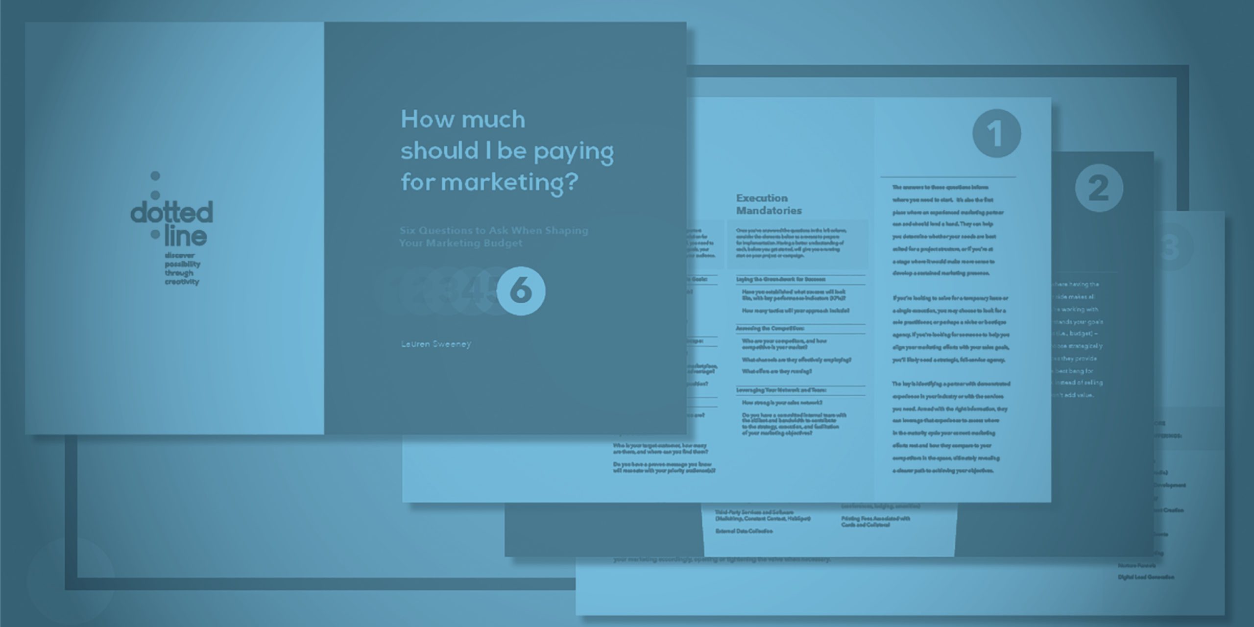
How much should I be paying for marketing?

Selecting the right marketing partner for your organization is no easy task. First, CMOs must navigate a saturated market of competing full-service agencies, creative collectives and freelance outfits. Once the hurdle of identifying an appropriate partner type is cleared, more questions arise about how to select the right choice from within that subset, how much it will cost to work with them, and how much additional funding to allocate towards non-agency costs, including media spend, trade show costs, print production and marketing technologies.

To combat the complexity of these decisions, Dotted Line has developed a series of six questions aimed at helping organizations find the right marketing partner for where their business is now and where it’s headed next. These questions and their corresponding answers have been outlined in our new marketing costs white paper, which can help you determine how much you should be paying for your marketing efforts, what to consider when choosing a marketing partner, and how you and your team can contribute most effectively to your marketing endeavors.

Our guide can be a valuable resource whether you’re entering into a marketing relationship for the first time or if you have an existing partner that you want to assess. After downloading this white paper, we encourage you to use it as a workbook of sorts to keep track of your questions, rationale and the solutions you unearth. As you proceed from one question to the next, answer each as honestly as you can to help create the most accurate reflection of your current state.

Click here to download your copy today.

Client Successes in COVID-19

The COVID-19 outbreak is changing the way people interact with society – from how we work to the way we consume information and goods. In fact, a recent study found that 71% of people say if they perceive that a brand is putting profit over people during this sensitive time, they will lose trust in that brand forever. With this in mind, many businesses are rethinking their marketing strategies or pivoting offerings to put the customer first.

Dotted Line clients are no exception. The businesses we serve are creating innovative solutions to better serve their clients and communities. Here are just a few of their stories.

Pediatric Associates of Richmond

One of Richmond’s longest running pediatric practices realized they had to shift the way they care for sick patients to alleviate patient and parent safety concerns. The team at Pediatric Associates of Richmond (PAR) immediately shifted their office procedures to allow designated space for wellness visits and separate space for sick visits. They began by offering mobile check-in option, so families could limit their exposure before heading in to see their pediatrician. They also started doing telehealth appointments for non-emergency cases, to lessen the flow of patients on-site. And finally, to provide an easy pathway to care for families not yet exposed to the disease, in in need of information, the team also launched a COVID-19 Blog to help parents navigate the crisis with reliable and trustworthy information. And the patient-first cherry on top: a downloadable coloring book to keep kids entertained at home.

Key Learning: Consider creating channels to communicate directly with your audience where they are. This transparency builds trust and preference.

Innovation Lab

With the shortage of PPE being felt worldwide, the team at Innovation Lab, a healthcare innovation incubator in Southern CA, recognized the need for a better way to protect caregivers and their patients in the ICU. The Lab looked at solutions within its pipeline that would address risks associated ventilators and the infectious agents often released during the transition between mechanical and manual ventilation. The team worked diligently to fast-track a product called the Baywin Closed Circuit Valve to help curtail the spread of virus. With their manufacturing partner and the FDA, they are in the process of manufacturing 5,000 of the valves for delivery to caregivers at the front lines.

Key Learning: Sometimes, the solutions we need are right in front of us, but it can be hard to see the forest through the trees. Let your customer’s demands help determine your priorities.

Petra

Petra, a construction and design firm, has been looking to support efforts in California to increase bed capacity. They have made contact with the State and FEMA to see how they can help. Their president Craig Beam says, “We play an important supporting role to those on the front lines. It’s important that we continue to serve our ministries so that they are ready to provide the care to those most in need.”

Key Learning: Leverage your contacts for the greater good. You never know what may come of it, but more often than not, it leads to a positive outcome.

Tech Knowledge Associates (TKA)

One of TKA’s values is to be a proactive industry leader in Healthcare Technology Management (HTM). The leadership team has shifted to use a real-time messaging platform to build an atmosphere of free-flowing ideas and information. TKA teams on the ground in hospitals in Northern California mobilized to build over 1,200 3D-printed face shields to distribute to local health groups.

Key Learning: No one knows what the “new normal” will look like. Consider innovations or process improvements that make your business stronger in the long run, even in a non-COVID era.

Knowledge Advisory Group

As a business that works almost entirely with nonprofits to analyze their data and guide business decisions, Knowledge Advisory Group was presented with a unique opportunity when a large portion of their client-base was forced to close their doors due to COVID-19. A local children’s museum came to Knowledge Advisory Group for help polling their members to see what it would take to return to the museum and when they would feel comfortable doing so. Knowledge Advisory Group designed and sent a survey that was able to outline the current landscape and how the museum could best reengage with their audience. Because of the financial restraints placed upon the museum and the business disruption caused by COVID-19, Knowledge Advisory Group performed this work pro bono, being a true champion for those in need during this difficult time.

Key Learning: You’re in business because you have a unique set of skills. Use these skills and your strengths to help your customers in new and creative ways.

In a time where we constantly hear stories of calamity and chaos stemming from this pandemic, we are proud to partner with and support the organizations that are doing their part to help us all navigate this crisis. It reinforces our commitment to our clients, our team, and our community to work towards making a positive impact. The work of this select group is inspiring but there is much left to do. We hope these stories of action and innovation are the impetus for positive change in your personal and professional life.

Dotted Line Named A Top Marketing Firm in Richmond

Each year, Richmond Biz Sense presents a list of top advertising, marketing and public relations firms in the Richmond area.  This year, Dotted Line Collaborations was added to the list as a top marketing firm in Richmond.

Find full list here.

Ad Rewind: memorable advertising

Richmond BizSense
Ad Rewind: memorable advertising and marketing moments
By Jonathan Spiers

From wind sprinting and yoga posing chia bars, to slow drawing sloths and “awful” Cobb Technologies coworkers, Richmond’s advertising industry gave us lots to look at in 2017.

It was a year that saw CarMax go “all in” for a used car in a parody ad, power-walking pickers turning into junkyard mechanics, and a new Richmond agency giving its first crack at a campaign for its one, and so far only, client: Google.

Here are our picks for this year’s standout locally produced ads, in no particular order, pulled from The Pitch and other BizSense coverage:

PARK GROUP/WORK LABS – HEALTH WARRIOR ANIMATED VIDEOS

Featuring 3-D animation created in Cinema 4D and After Effects, the four 15-second videos for local health food company Health Warrior feature its protein and chia bars weightlifting, running a marathon and performing wind sprints and yoga poses. The videos were a collaboration between production studio Park Group and brand agency Work Labs.

Barber Martin’s campaign for Chesterfield Auto Parts included 15- and 30-second  TV and online video spotsfeaturing a mechanic speaking with someone else’s voice who’s revealed to be a young man or woman. The campaign targeted young pickers and females with television, digital, radio and outdoor advertising.

DOTTED LINE COLLABORATIONS – “THE SOUTH, SOUTH OF THE RIVER”

The ad giant’s latest campaign for longtime client Geico kicked off with this 30-second spot starring a sloth drawing pictures at an extremely slow pace, followed by a spokesman saying, “As long as sloths are slow, you can count on Geico saving folks money.” The campaign, called “Count On,” came on the heels of the final spot for Geico’s long-running “It’s What You Do” campaign.

Known for its ubiquitous radio ads, the local office equipment supplier worked with Studio Center to release its first pair of TV commercials, which feature the company’s employees and voiceovers by owner Freddy Cobb.

The Richmond ad scene’s newest kid on the block released a campaign for Google Chromebook – the agency’s first work for Google since launching in November.

DREAMS FACTORY – ONE BELT, ONE ROAD PROMO VIDEO

While produced by China’s CCTV to promote the country’s One Belt, One Road trade initiative, it took Richmond-based filmmaker Sunny Zhao’s Dreams Factory to bring this 90-second spot to life. Zhao spent 10 days shooting in various countries along the trade route, directing and taking turns behind the camera. The video opened a two-day summit in Beijing and aired as the initiative’s first commercial on CCTV, China’s main state-run television broadcaster.

NDP – “GIVE THE GIFT OF MAYMONT

Playing on the 19th-century estate’s history as a gift to the city, the pro bono campaign’s posters advertised gift boxes from the fictional “Maymont Memory Company” containing Maymont-specific items and experiences, such as skipping rocks at the Japanese Garden koi pond and blades of grass on Maymont’s rolling hills. Billboard ads promoted such deals as “Free Vitamin D with every visit!” and “Get one grass-stained knee, get another for free!”

Barber Martin’s latest campaign for Virginia Lottery presented lottery scratch games as holiday gift ideas. Including two TV spots, two radio spots, a digital video, and outdoor, print and point-of-sale ads, the campaign involved video production work from MadBox and audio work from Red Amp Audio.

CARMAX – “CARMAX GOES ALL IN FOR ’96 HONDA ACCORD

The used car retailer created a 90-second video to respond to a parody ad that went viral on YouTube. The parody ad, by California writer-director Max Lanman, offered to sell his girlfriend’s 1996 Honda Accord starting at $499. CarMax responded with its own video, produced by North Carolina-based agency McKinney, offering to buy the car and other items in the ad for $20,000. Lanman would take CarMax up on its offer, while CarMax’s video, starring McKinney creative director and Brandcenter alum David Sloan, rode the wave of exposure with more than 293,000 views.

Continue to Richmond BizSense.

From Entrepreneur to Enterprise

Tory Burch Fellows Presentation Collage

The Challenge

Dotted Line Collaborations spends every waking hour helping clients achieve their business goals through creative marketing. But when we made the finals of the esteemed Tory Burch Foundation Fellowship, we had to practice what we preach. With only 24 days to gather more votes than the other finalists, our Dotted Line team needed its own campaign to raise awareness about the Fellowship and encourage as many friends, fans, and strangers alike to vote. And do it in a way that would make the Tory Burch Foundation take note of our nimble and creative team.

The Solution

The solution started with our core strength: collaboration. We knew that we needed to leverage the support of all our connections. With an overarching campaign idea of supporting women in business, we came up with easy and engaging ways to remind people to vote for us while raising awareness around female entrepreneurship. The campaign didn’t focus solely on DLC — we highlighted inspiring female leaders from the Richmond region to create mutually beneficial buzz around the Fellowship and its mission of empowering female business owners.

By the end of the three weeks, we had done an astounding amount of marketing, including 2 local press features, an event with over 80 attendees at Quirk Hotel, a shout out from the nationally recognized 3% Conference, and over 185 shares on Facebook. Our message reached over 5,000 people, drove 1,400 new visitors to our website, and led to over 3,000 votes in the competition.

Best of all, we won! As a Tory Burch Fellow, our CEO, Lauren Sweeney, won a year-long fellowship full of resources and education, a $10,000 grant, and a chance to pitch for $100,000 investment from the Foundation. All proof that creativity and collaboration can pay off in remarkable ways.